Sophie Kate Photography
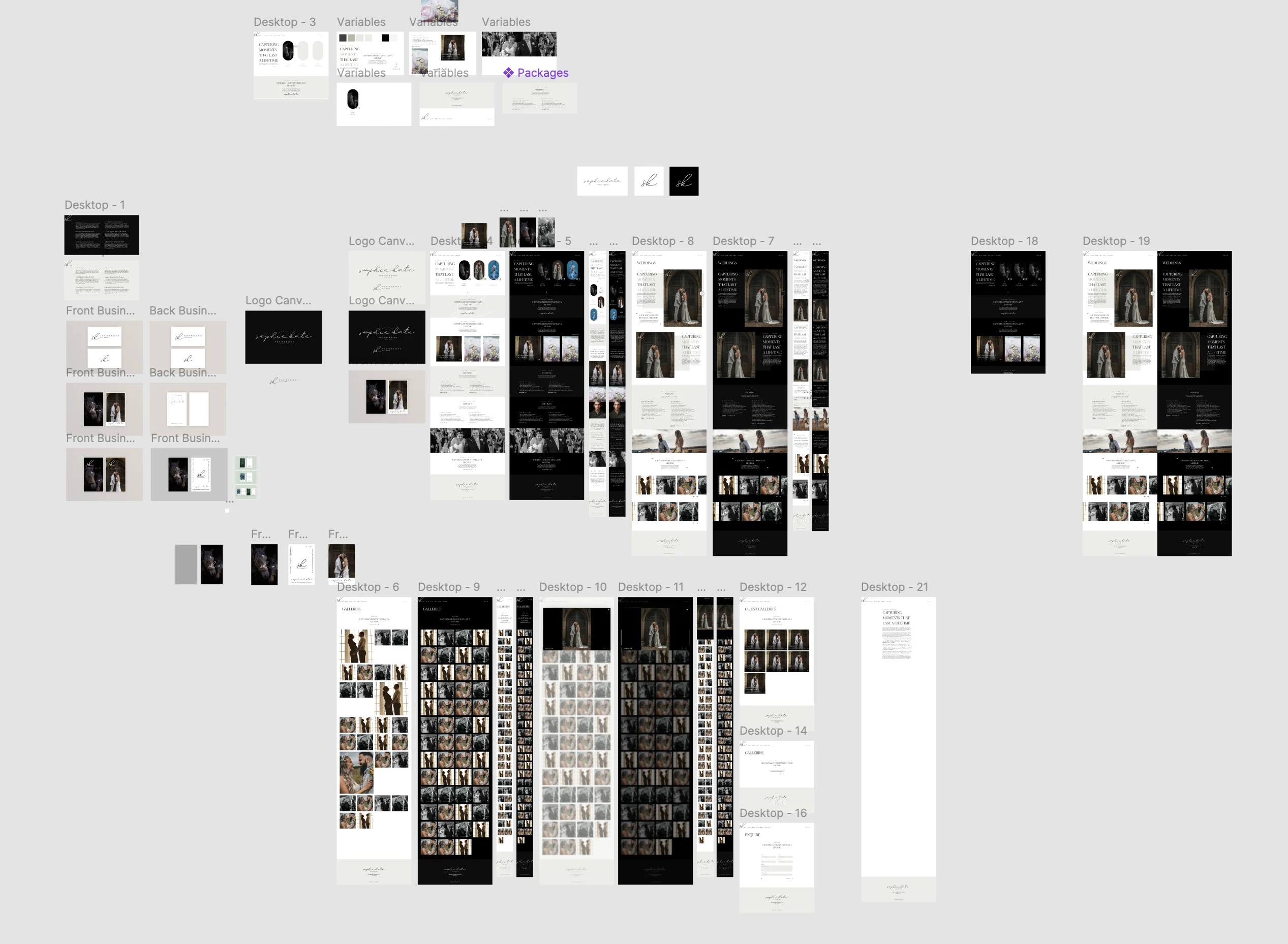
Sophie Kate Photography brings together wedding, equestrian and portrait photography. I developed the brand and website to give those different areas a consistent identity, with the photographs taking the lead and clear routes into each service.
The identity began with Sophie Kate’s signature and grew into a wider system of expressive typography, muted colours and photographic layouts. The website carries that style through dedicated service pages and private client galleries, balancing a distinctive first impression with straightforward browsing.

JavaScript
Used

WordPress
Used

Tailwind
Used

Figma
Used

PHP
Used

CSS / SCSS
Used

UI
Used

GitHub
Used

HTML
Used
Goal
Create a distinctive brand that presents the photography with confidence and makes the available services clear to prospective clients and wedding venues. The website needed to give the work room to speak while helping visitors find the service and next step that suited them.
Tone
Refined, personal and approachable. The signature logo and expressive typography give the brand character, while muted colours and generous space keep attention on the photographs. The aim was to communicate quality across a range of customers and occasions.
Logo Design
I used Sophie Kate’s signature as the starting point for the logo, exploring different arrangements before settling on a simplified mark. The flowing handwriting gives the identity a personal quality, reflecting a business where clients are choosing the photographer as much as the photographs.
The expressive signature is balanced by the small, structured Photography lettering beneath it. Light and dark versions give the mark flexibility across the website and printed materials, while keeping the same recognisable shape. The result feels considered and refined, with enough character to stand on its own beside the imagery.
Website Design
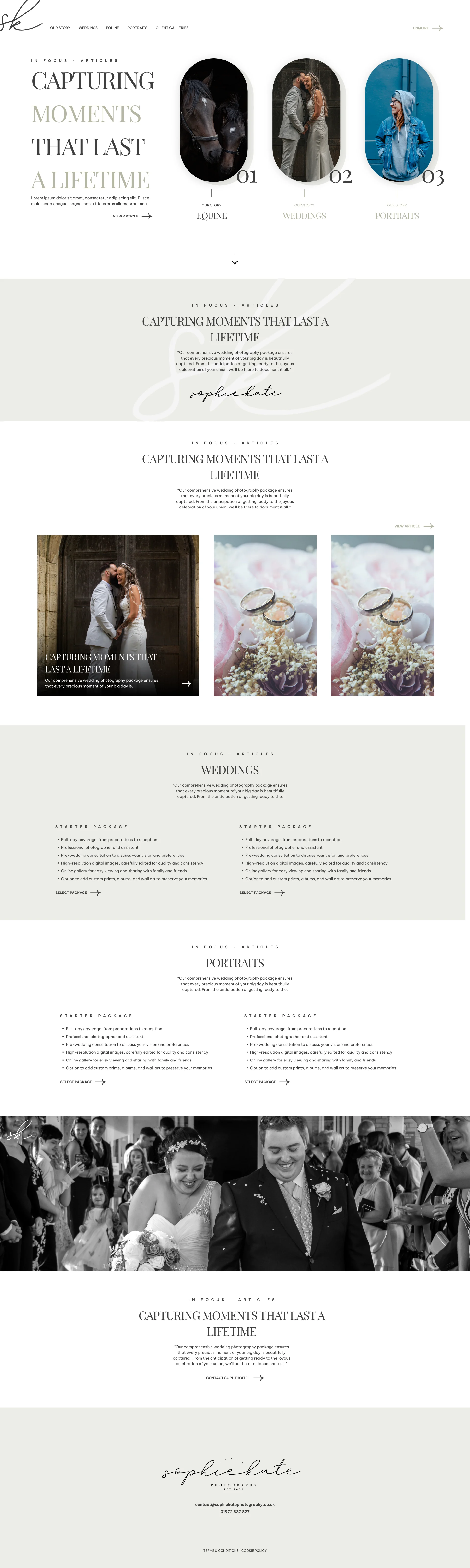
The website introduces Sophie’s work through large photographs, expressive headings and a clear overview of the services. Wedding, equestrian and portrait photography each have their own route through the site, helping visitors find relevant work and information without losing the sense of one connected portfolio.
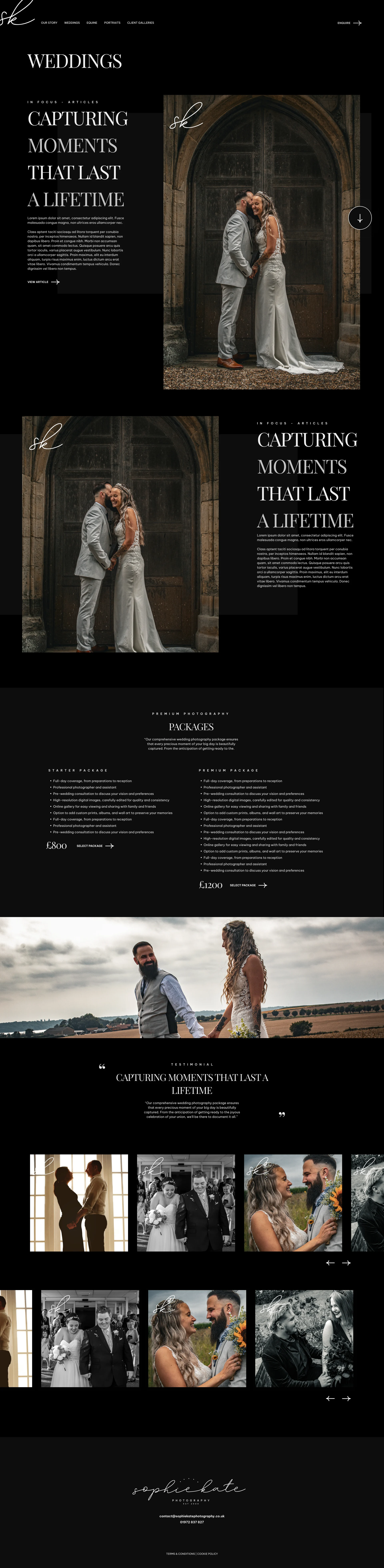
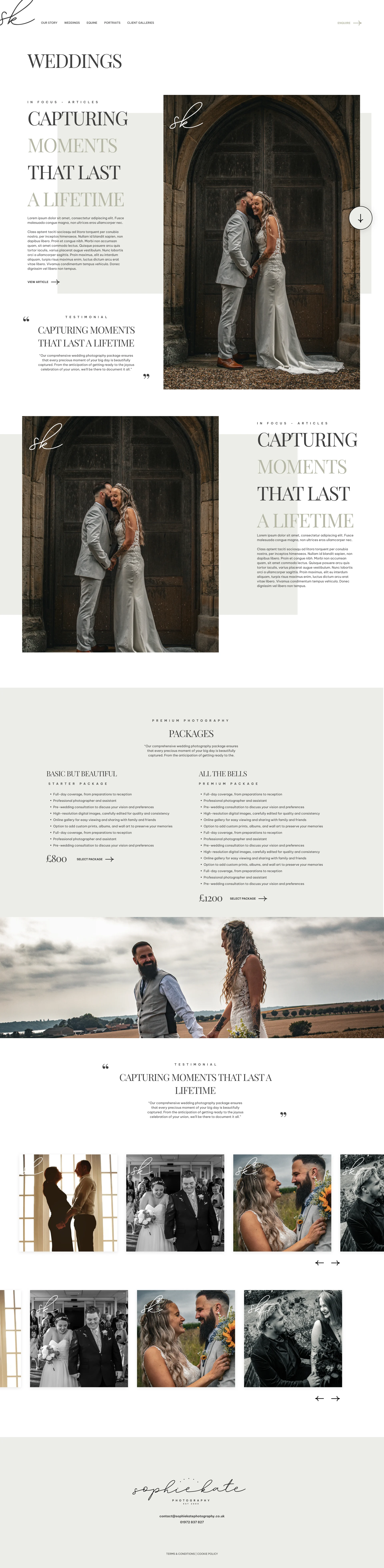
I carried the identity into the page layouts through generous spacing, muted colours and contrasting light and dark treatments. The photography sets the pace, with supporting copy providing context and a clear next step. Private client galleries give existing customers a dedicated place to view their photographs, alongside the public portfolio for prospective clients.
Branding
The wider identity brings the signature logo together with distinctive typography, a muted colour palette and layouts that give the photography room to breathe. These elements create a consistent setting for very different subjects, from a wedding day to an equestrian event or an individual portrait.
I explored how the identity could carry across business cards, printed pieces and the website, using the same balance of expressive type and quieter supporting details. Keeping those choices consistent gives the brand a recognisable presence across each application, while allowing the photographs to supply the colour, emotion and personality.