Wilder & Root
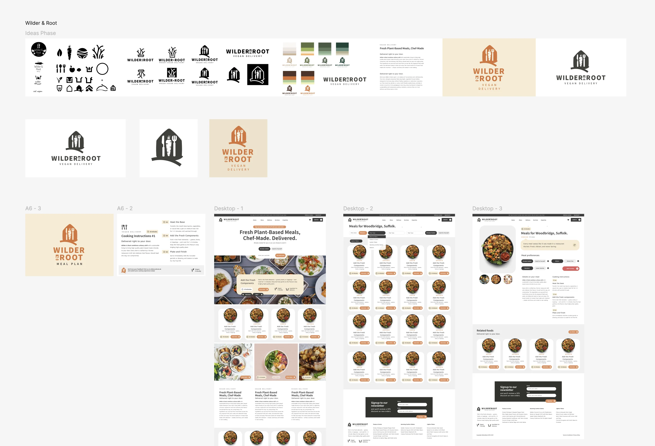
Wilder & Root is a brand and ecommerce design concept for a UK plant-based meal delivery service. The brief centres on fresh, chef-designed meals made with locally sourced produce, with an identity that feels earthy, modern and considered.
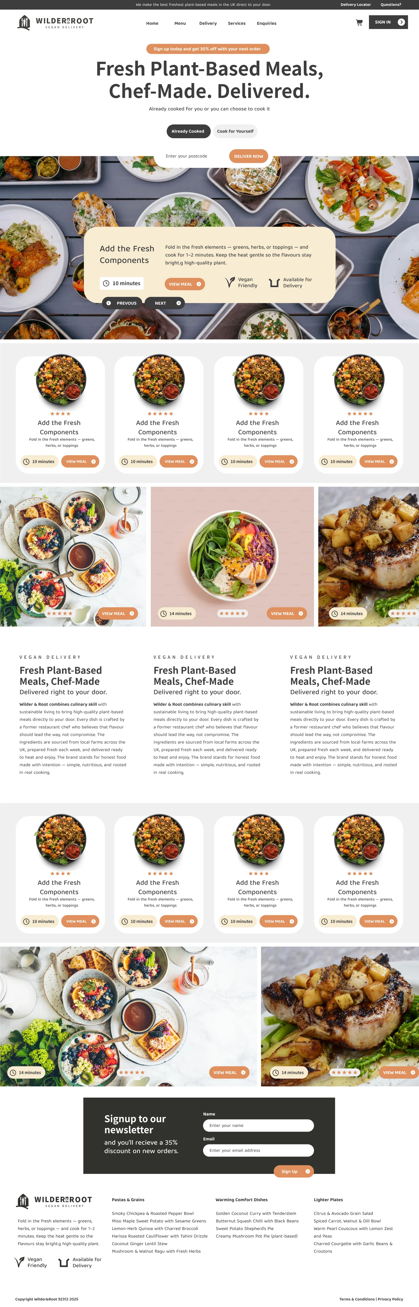
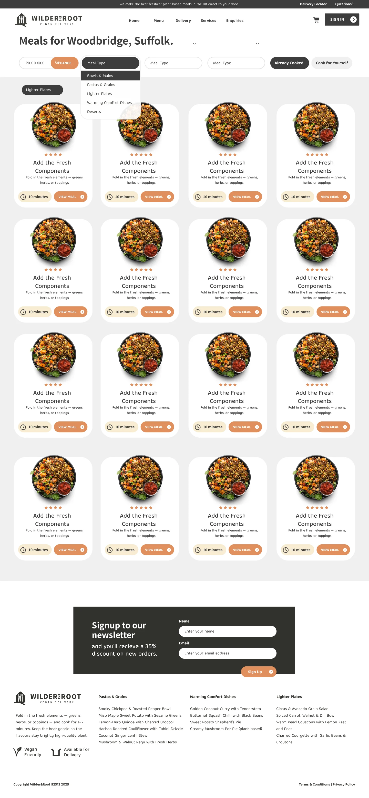
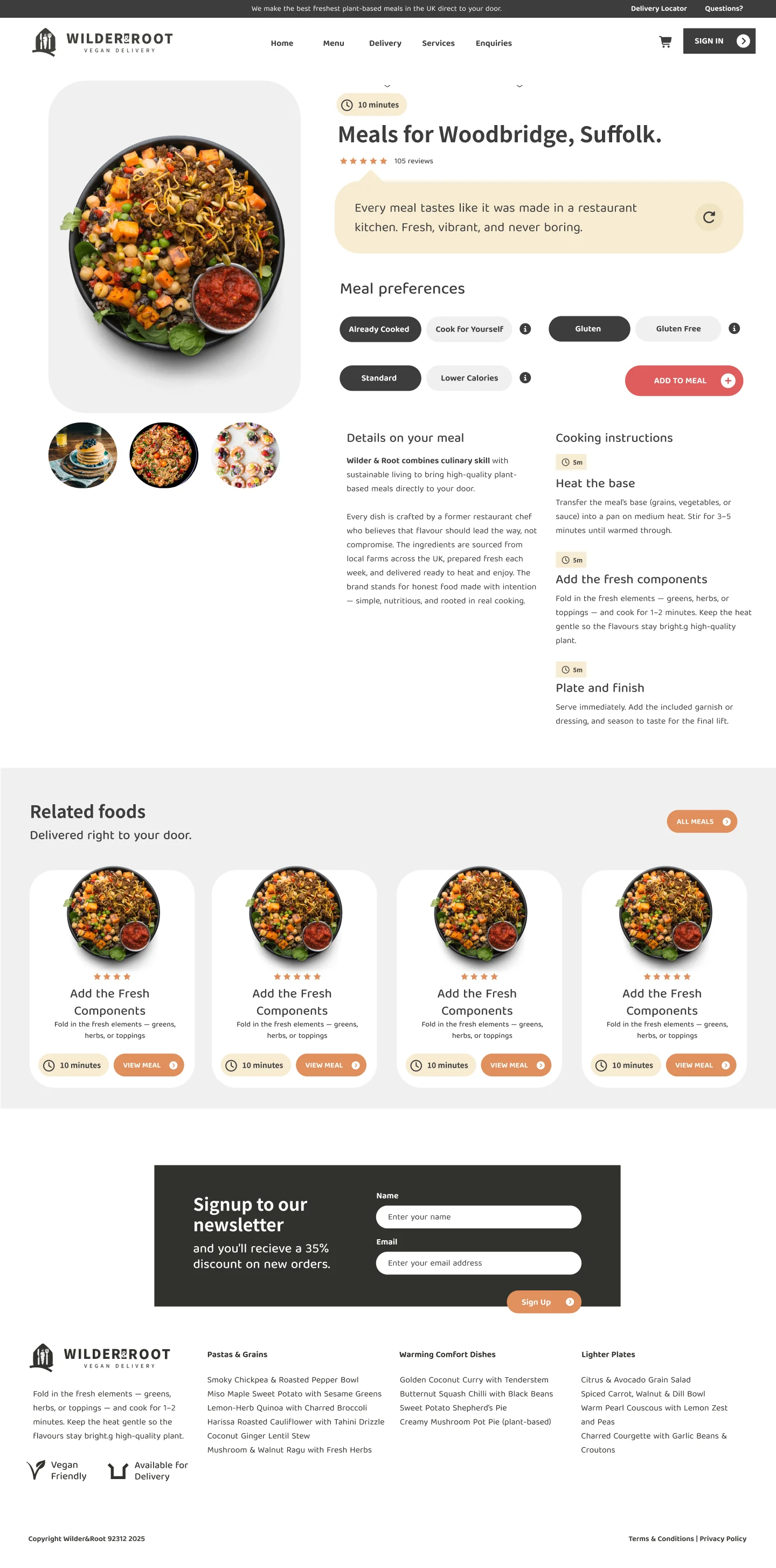
I developed the logo, typography, colour palette and website layouts around the way people choose their food. The designs cover the homepage, product listing and individual meal pages, bringing product imagery, dietary information and ordering actions into a clear browsing journey.

Figma
Used

Affinity Designer
Used

UI
Used

Apple Pencil
Used
Goal
Create a nourishing, quietly confident brand for busy people who care about food, health and sustainability. The website needed to make the meals easy to explore and give professionals and families a clear route from browsing to choosing what to order.
Tone
Premium and approachable, with the warmth of an independent food brand. Earthy colours and a restrained visual style support the quality described in the brief, while clear product information keeps the experience practical for everyday meal planning.
Logo Design
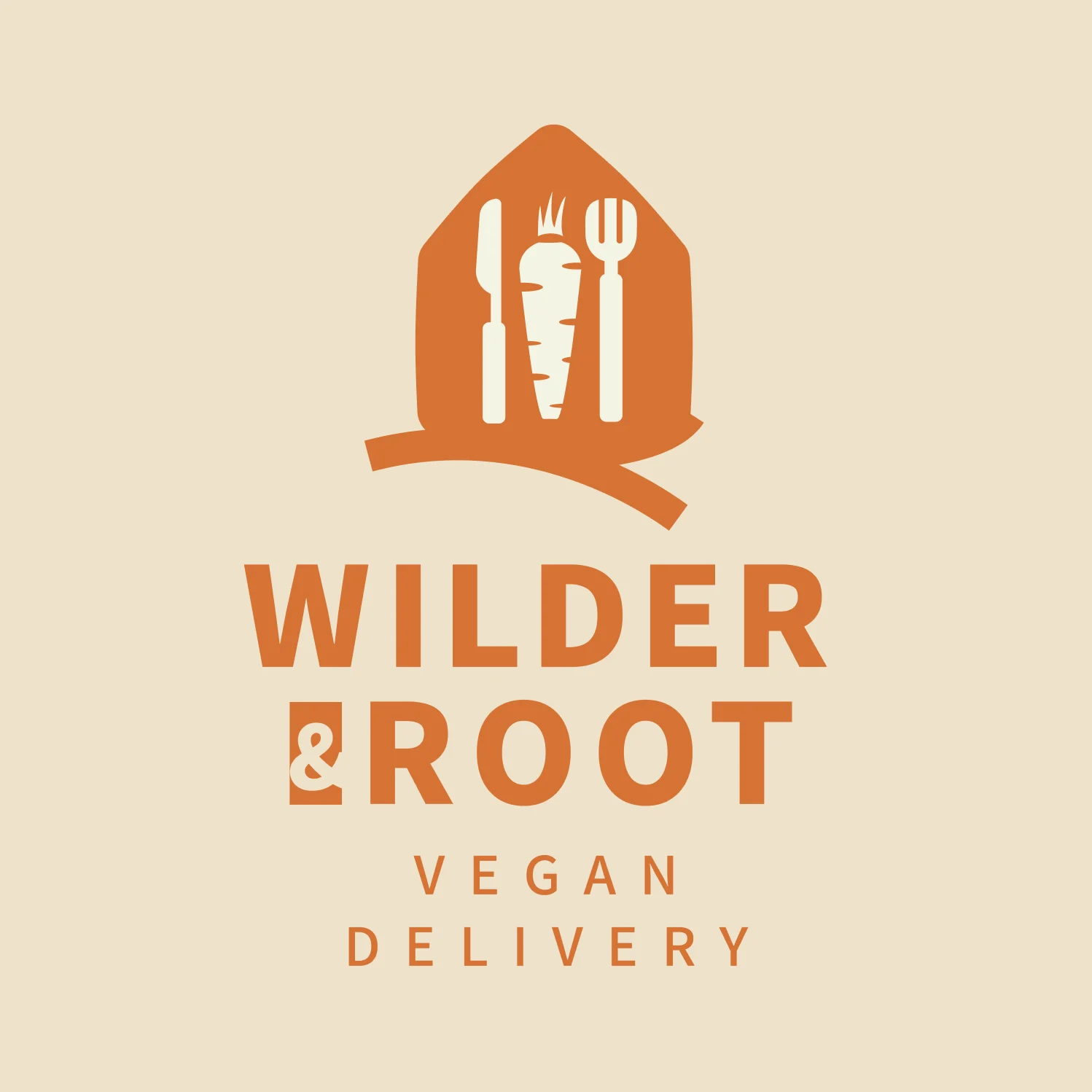
The brand icon brings a carrot, knife and fork together inside a rounded shape, with a root-like line extending beneath it. The combination makes the connection between ingredients and eating explicit, giving the plant-based meal concept a symbol that is easy to understand.
I kept the forms simple enough to work as a standalone icon as well as alongside the Wilder & Root name. The colour treatments explore how the same identity can appear across different backgrounds while retaining its earthy character and recognisable silhouette.

Website Design
The website concept centres on the meals, using food photography, clear product names and prominent ordering actions to guide the browsing experience. The homepage introduces the offering, the listing page helps people explore the range, and individual product pages provide more detail about each dish.
I used the brand’s earthy colours and distinctive typography to give those pages a consistent character. Dietary information and product details sit alongside the imagery, supporting the practical decisions people make when choosing meals for themselves or their families.
Branding
The wider branding explores a grounded, approachable direction for a fresh meal delivery service. Muted colours, expressive typography and simple shapes connect the identity to food and ingredients, with a considered feel suited to the chef-designed meals described in the brief.
I carried those choices through the brand applications and website designs so the name, icon and product presentation feel connected. The concept balances a distinctive visual identity with the clarity needed to introduce unfamiliar dishes and explain the service to new customers.