Harbour Roastery
Harbour Roastery is a brand and website design concept built around an independent coffee roaster on the English coast. The brief imagines an established business with 15 years of roasting behind it, a loyal local following, and an identity and online shop ready for a refresh.
I explored how its coastal character could carry through a more contemporary identity and website, with coffee, craft and café life at the centre. The work covers the logo, typography, colour direction and page designs, bringing the roastery’s story and practical information into one connected experience.

Figma
Used

Affinity Designer
Used

UI
Used

Apple Pencil
Used
Goal
Bring craft, sustainability and coastal life into a coherent identity that can speak to local visitors and people buying coffee online across the UK. The design needed to make the business feel current while keeping the warmth and familiarity of an independent roaster.
Tone
Warm, confident and minimal, with an artisanal character grounded in the coast. The harbour and lighthouse motifs, coastal colours and café photography give the identity a sense of place, while clear typography keeps the website easy to follow.
Logo Design
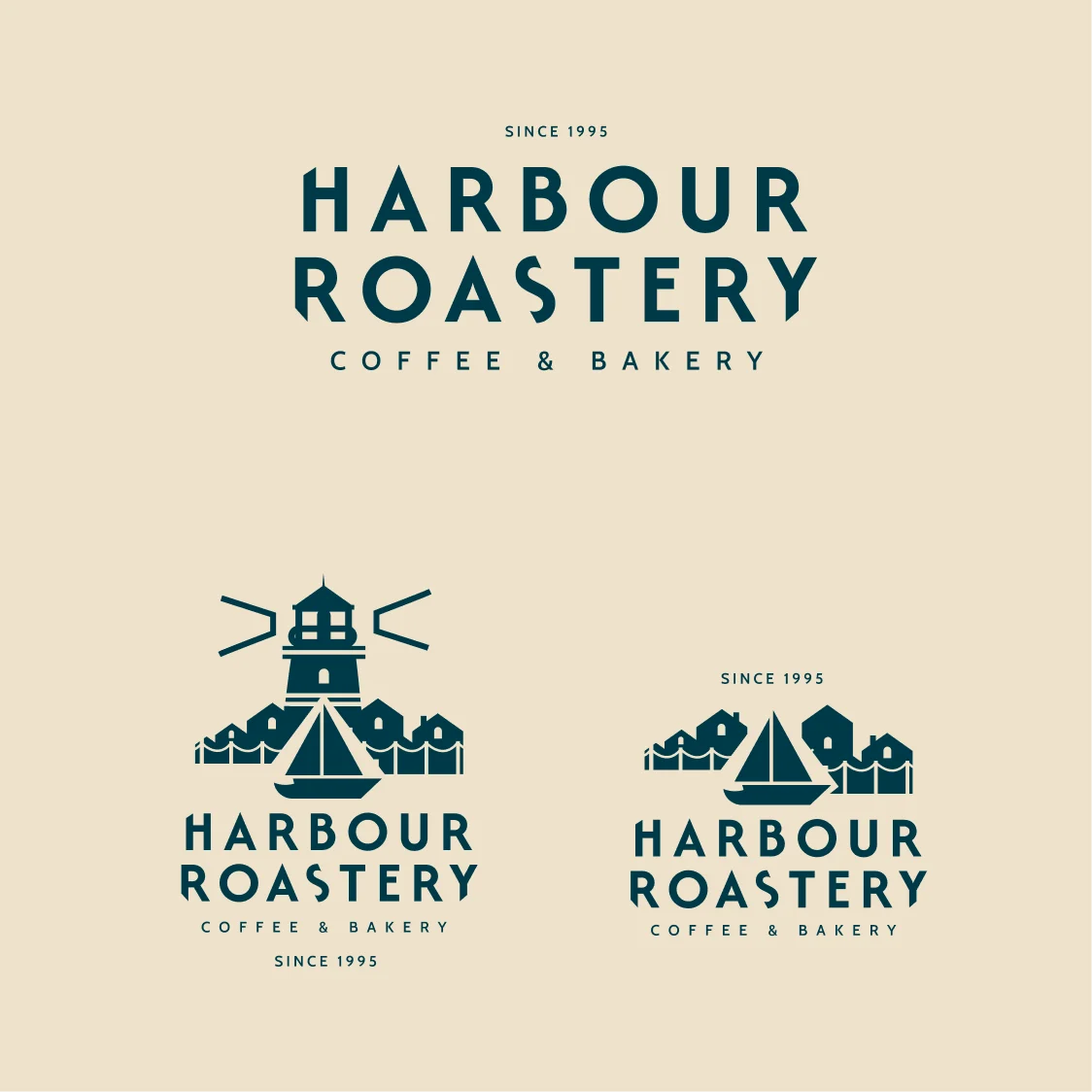
The logo takes its cues from the harbour, using a simple sailing boat as the central symbol. Its geometric sails and hull sit against a soft, rounded background, pairing a clear coastal reference with the warmth of an independent café.
I explored the symbol alongside customised lettering to give the roastery a recognisable identity. The separate mark and full logo offer different ways to use the design, from a small detail on packaging to a more prominent introduction on the website.
Website Design
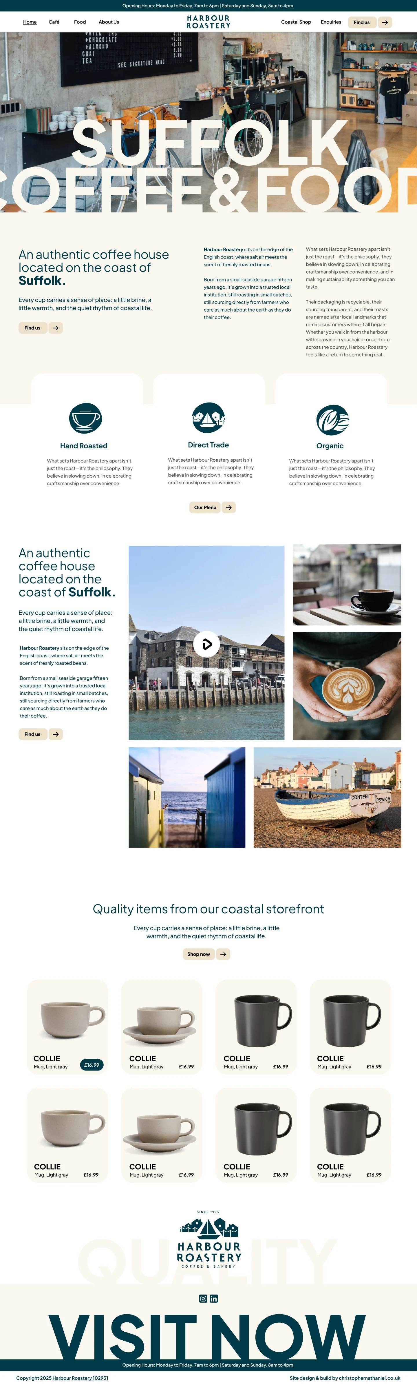
The website concept brings the coffee and its coastal setting together from the opening view. Café photography, harbour colours and lighter backgrounds introduce the place, while short passages of copy explain the roastery’s story and what visitors can expect.
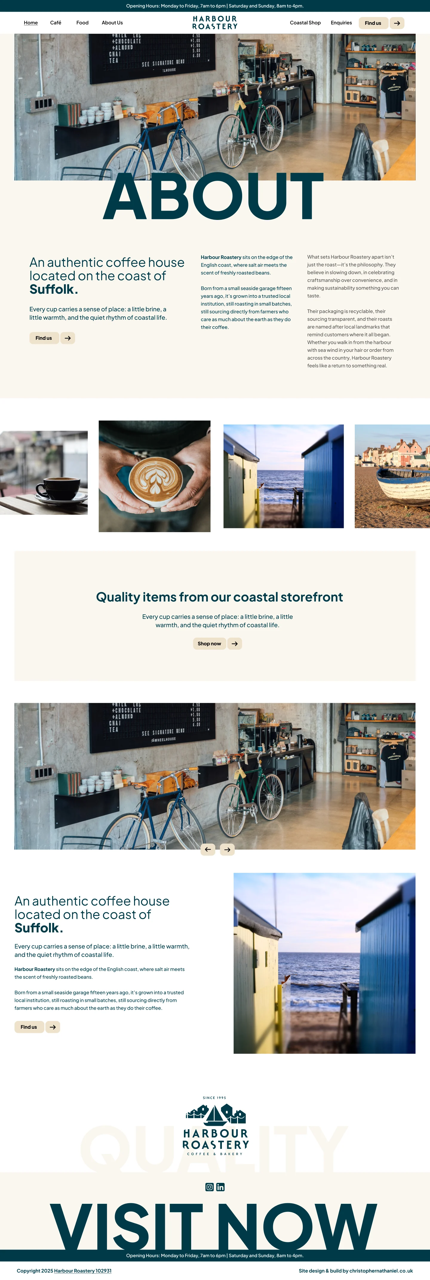
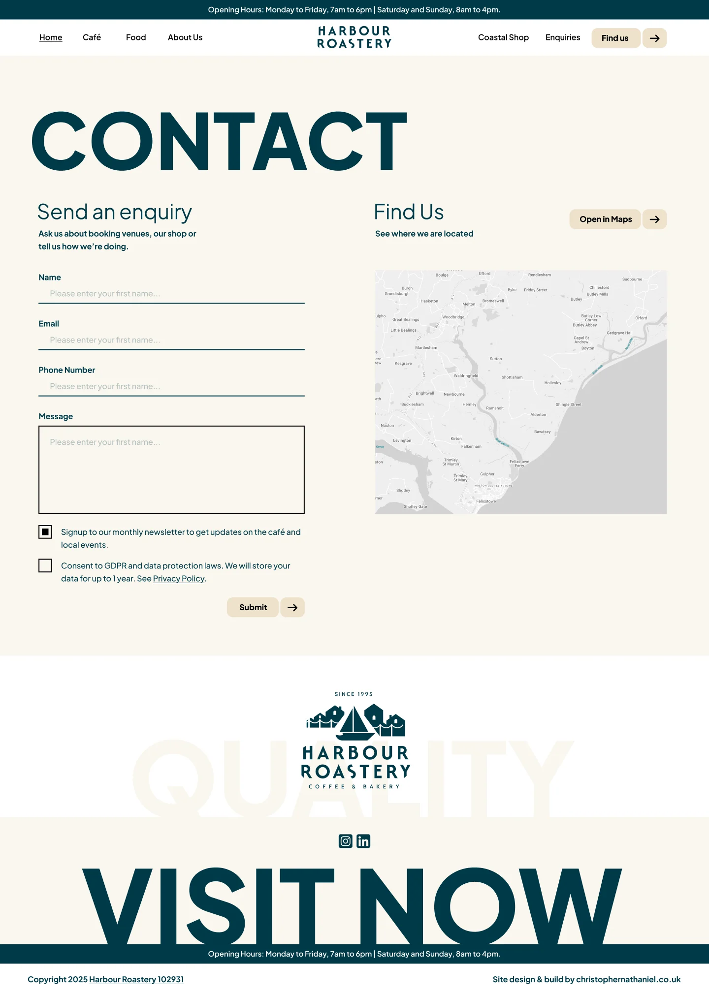
The homepage establishes that character before leading into more detailed information. Supporting About and Contact page designs carry the same typography, spacing and colour choices through the site, giving the concept a consistent structure for both local visitors and people discovering the brand online.
Branding
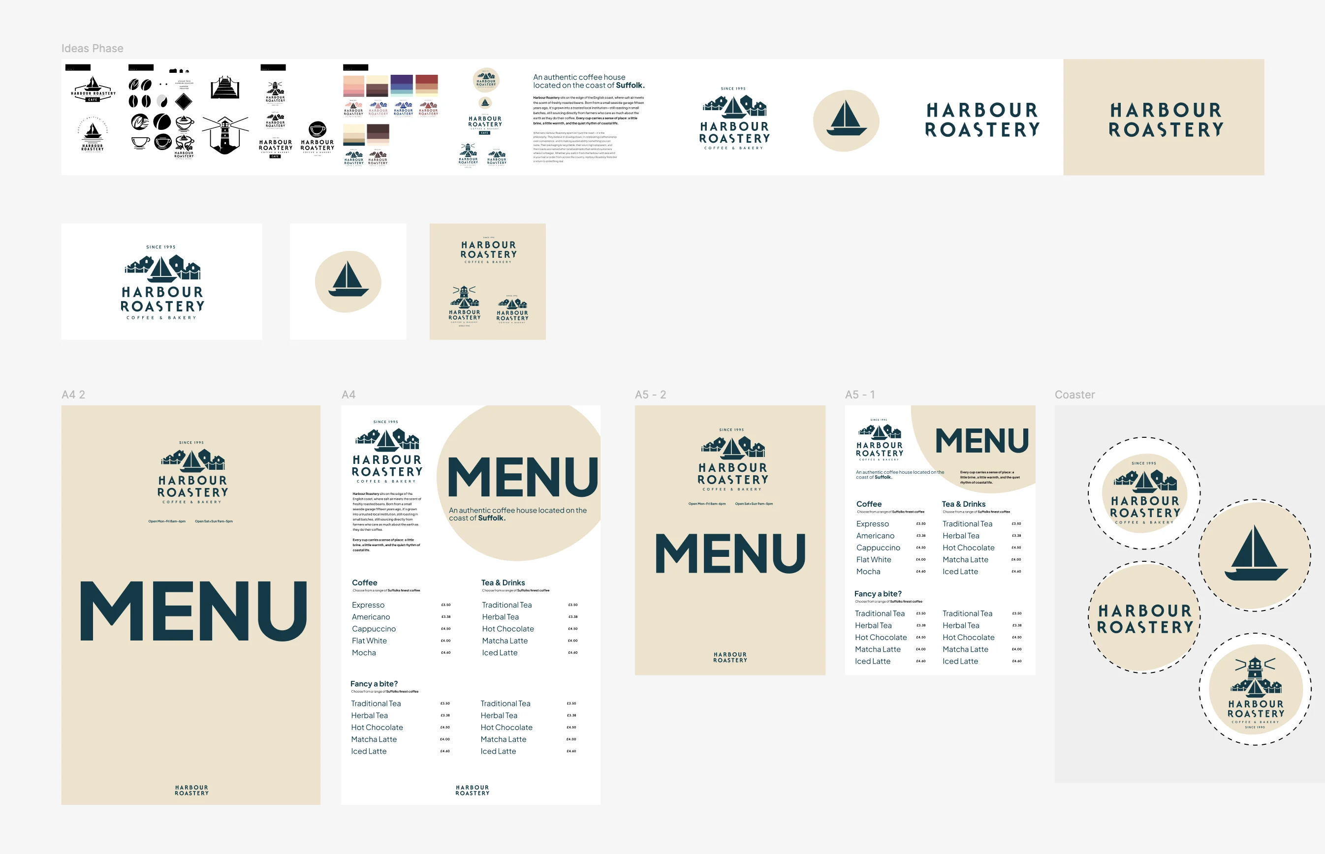
I developed the wider identity around a balance of coastal colour, clear typography and café imagery. Deep blue-green and warm cream give the sailing-boat mark a distinctive setting, while the supporting layouts leave room for the coffee and the people and places around it.
The brand and print concepts explore how those choices could work beyond the website. Repeating the same symbols, colours and type treatments keeps the identity connected across applications, giving the imagined roastery a consistent way to present its craft and Suffolk coastal setting.