Northbound Wellness Clinic
Northbound is a small, independent physiotherapy and sports injury clinic expanding from one treatment room to a full wellness studio. They’ve operated for years on word of mouth, and they needed a proper brand identity and a clean, trustworthy website to attract runners, office workers, and people dealing with long-term pain. Their existing logo was dated, their booking process was clunky, and their online presence felt like a placeholder.
Figma
Idle
Affinity Designer
Idle
Apple Pencil
Idle
UI
Idle
Goal
Create a brand that feels sharp, professional, calm, and reassuring, but not clinical or cold.
Tone
Northbound’s tone sits in that sweet spot between clinical trust and approachable wellness. Nothing overly medical. Nothing too fluffy.
The brand feels calm, clear, and trustworthy. The design voice communicates competence without ego, and care without clichés.
The brand feels calm, clear, and trustworthy. The design voice communicates competence without ego, and care without clichés.
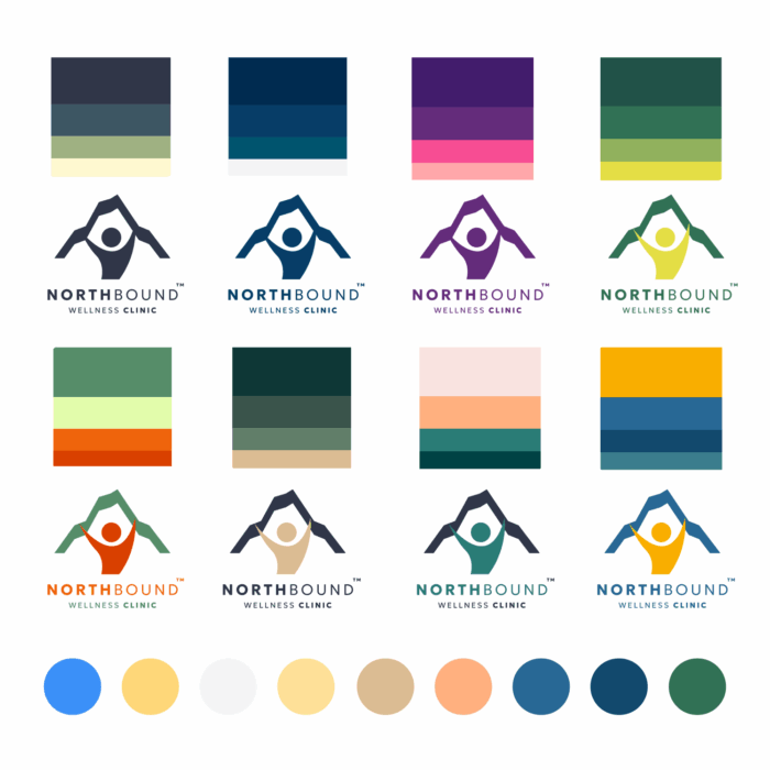
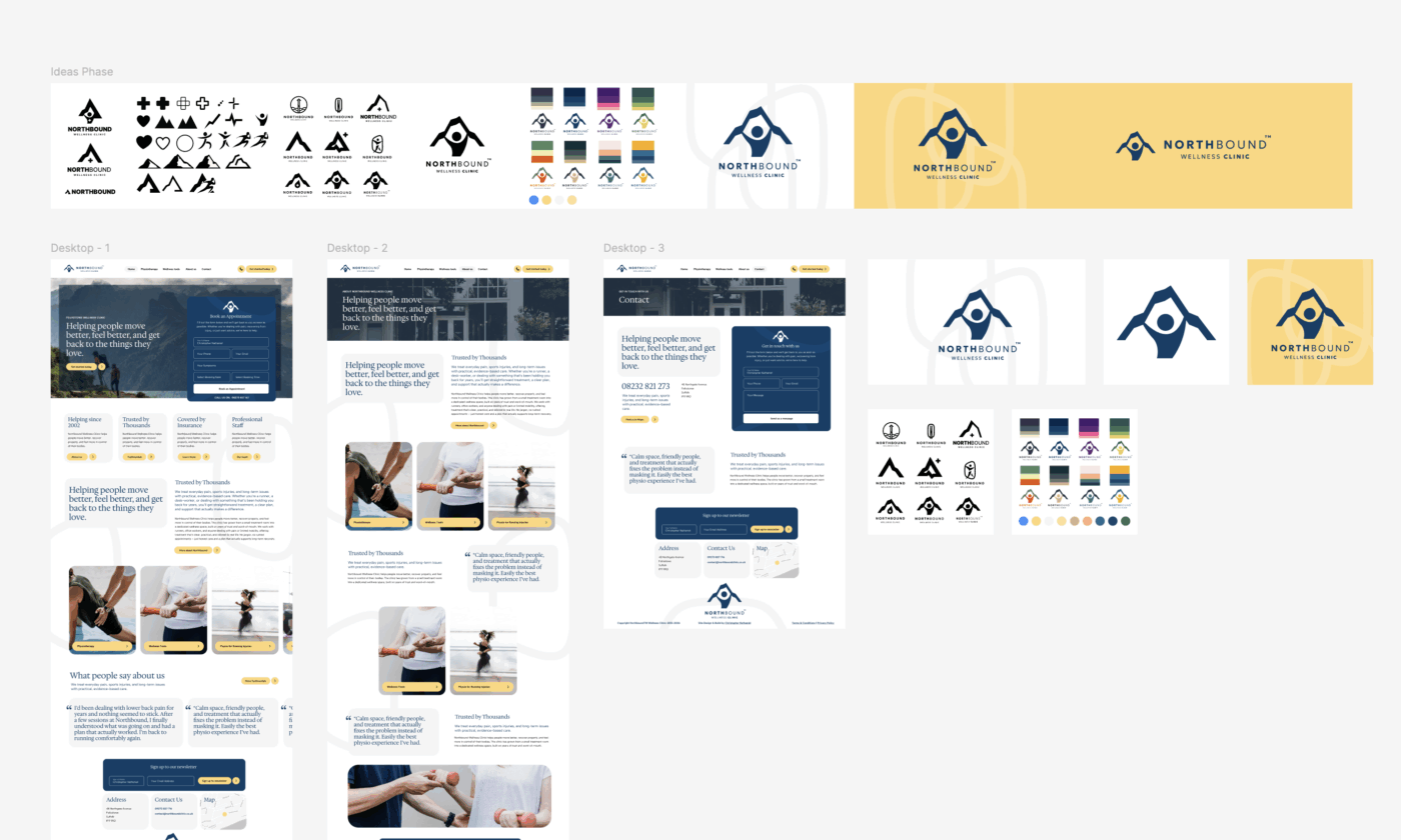
Logo Design
The logo is a beautiful piece of branding, created using the signature of Sophie Kate. After a variety of combinations I arrived at this simpified symbol which has been used to show the premium feel my client wished to represent.
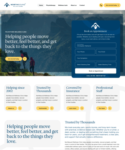
Website Design
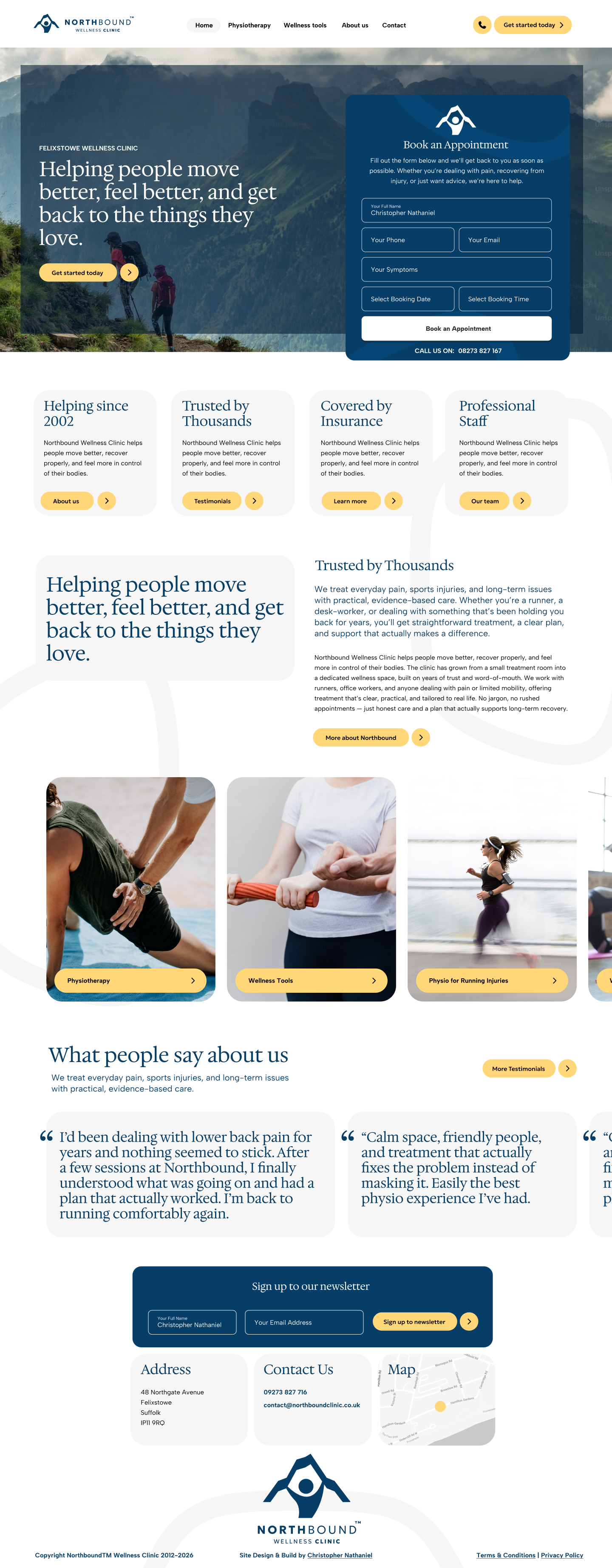
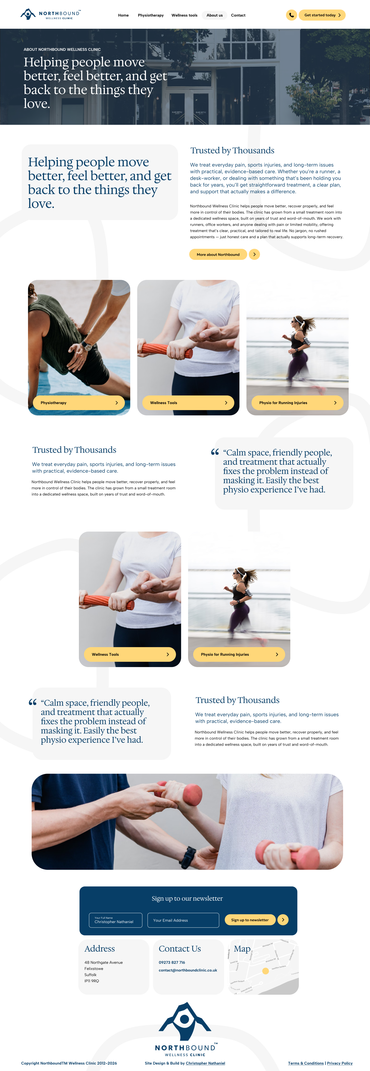
The Northbound website feels like walking into a calm, organised clinic with a clear structure, no clutter, and a sense of steady upward progress that echoes the brand name. The navigation is clear and predictable, the contact form and call to actions are clear and the imagary lends itself to adventure and recovery.
The design isn’t trying to impress, its trying to give clear direction and useful information to those who need it.
The design isn’t trying to impress, its trying to give clear direction and useful information to those who need it.

Branding
Northbound’s branding is clean, calm, and deliberately understated, built to feel supportive rather than shouty. The soft neutrals, clear typography, and subtle upward cues give it a sense of steady progress without leaning on clichés. It strikes the balance between clinical trust and approachable wellness, creating a look that feels modern, human, and genuinely helpful.