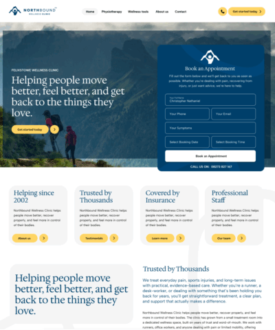
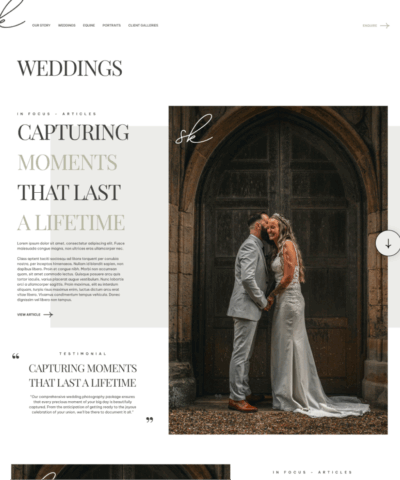
Haven & Co
Haven & Co. is an idea that let me build a complete brand and website identity for their new coworking space. They needed an identity that felt modern, warm, and genuinely creative and something that would attract freelancers, small teams, and founders. The project required a full visual direction, a flexible logo system, and a website that told a clear story of community, focus, and shared energy.
Figma
Idle
Affinity Designer
Idle
Apple Pencil
Idle
UI
Idle
Goal
The goal was to design a brand that balanced professionalism with comfort, giving Haven & Co. a visual presence that reflects the way the space feels in real life.
Tone
The brand tone leaned toward calm confidence: friendly, human, and grounded, with a creative edge.
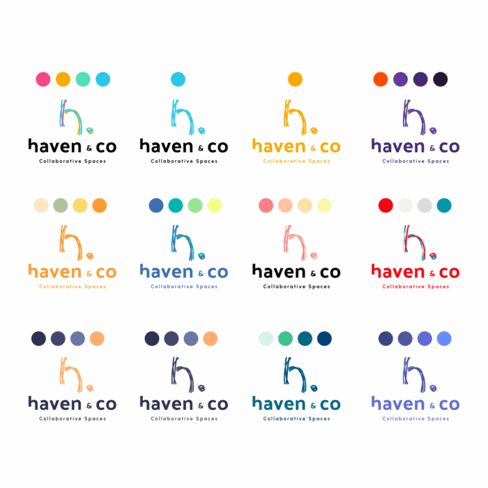
The colour choices worked to make the space feel welcoming, productive, and community driven.
The colour choices worked to make the space feel welcoming, productive, and community driven.
Logo Design
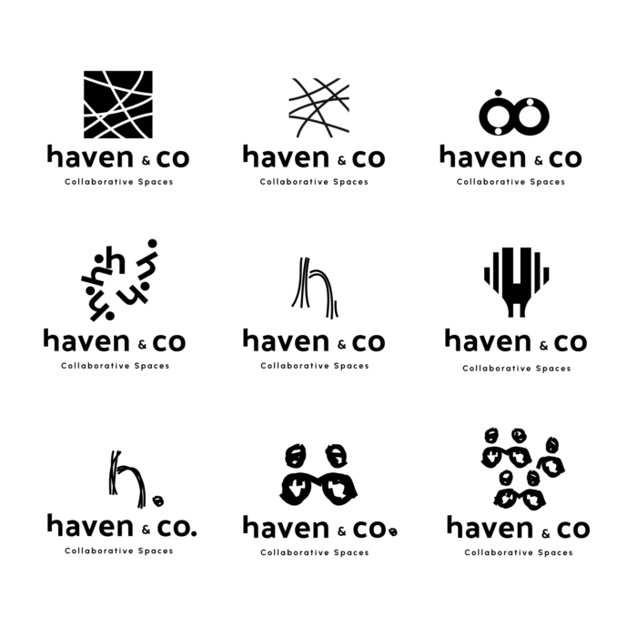
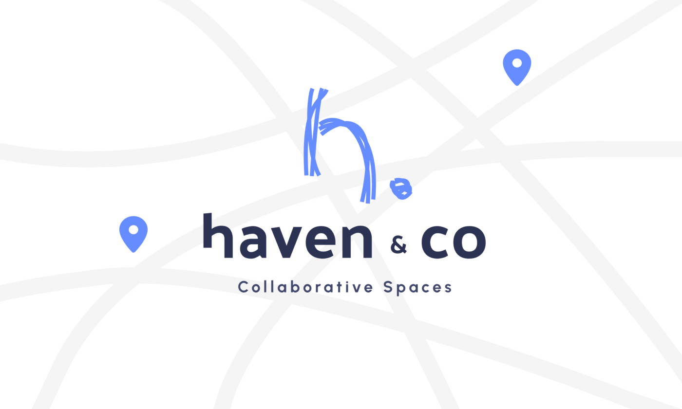
The logo focuses on a chaotic creative but somewhat calm feel. Soft lines and clean typography create a mark that feels modern, warm, and confident. The idea to craft creative lines in to the ‘h’ created a brand that felt new, modern and part of a creative movement.

Website Design
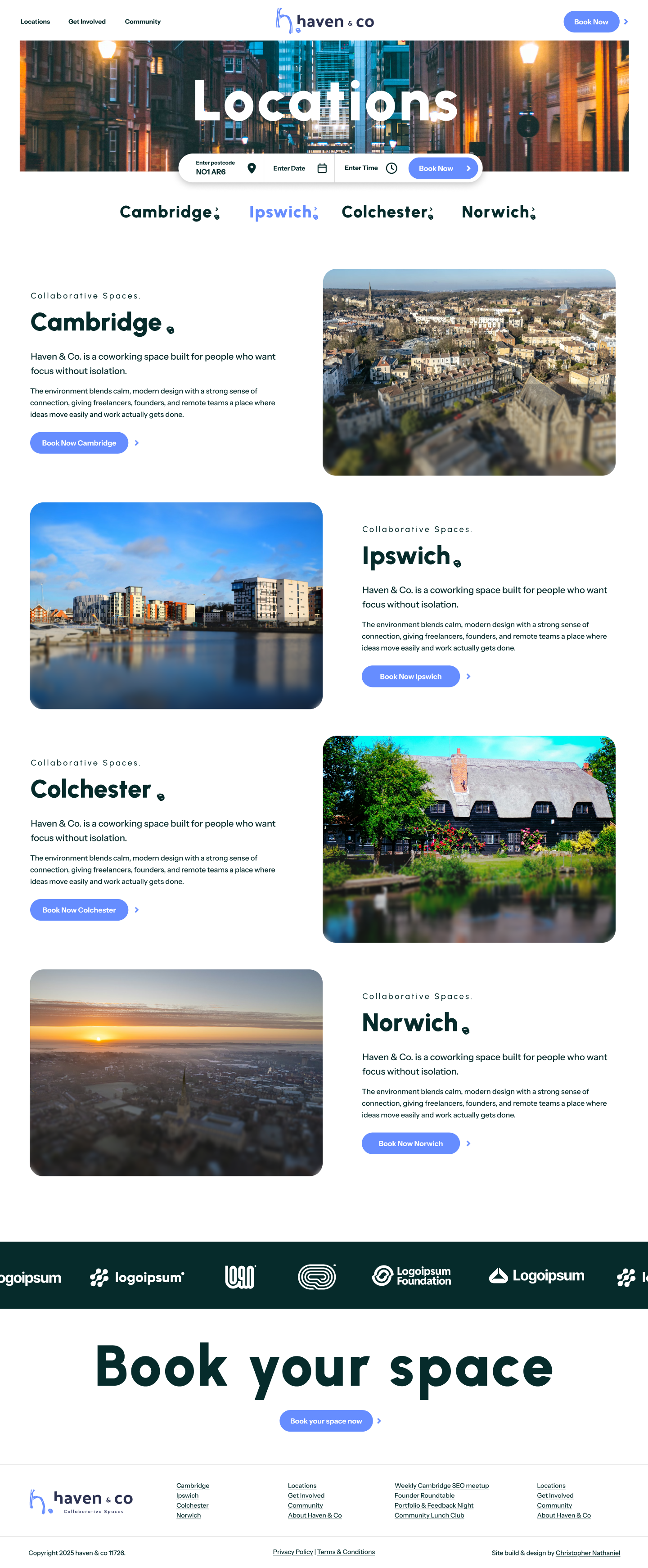
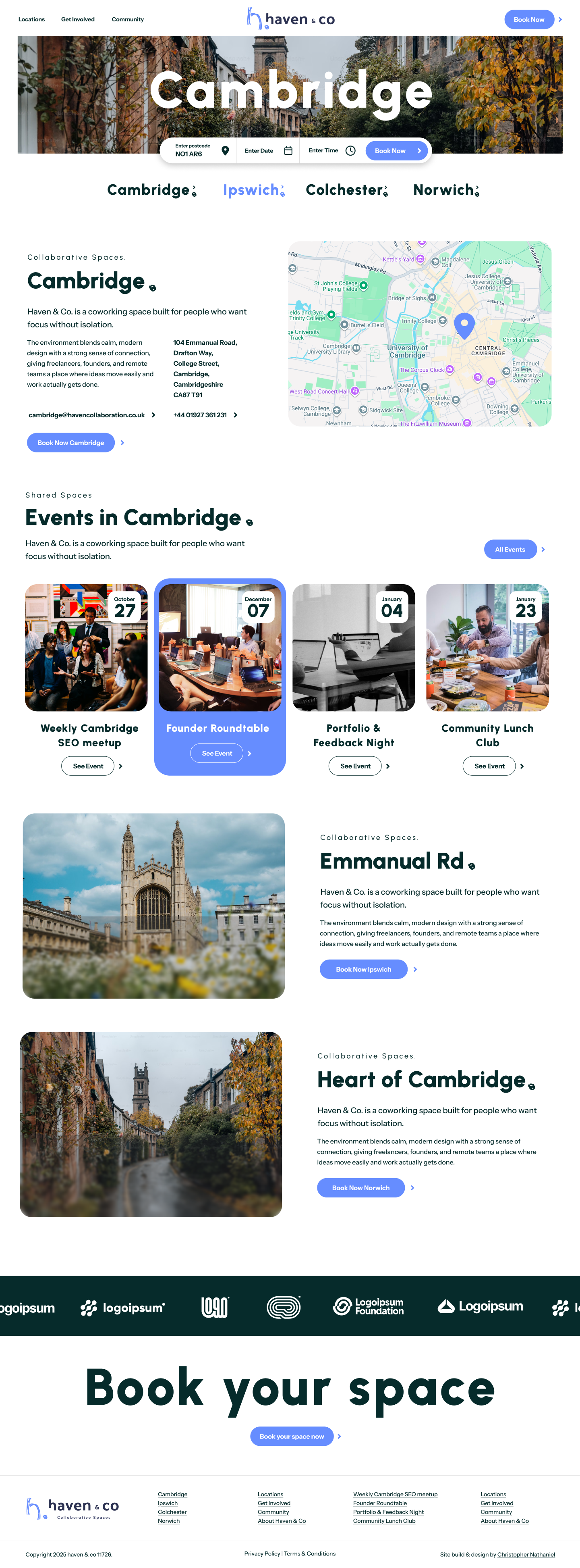
Haven & Co introduces a bold website design.
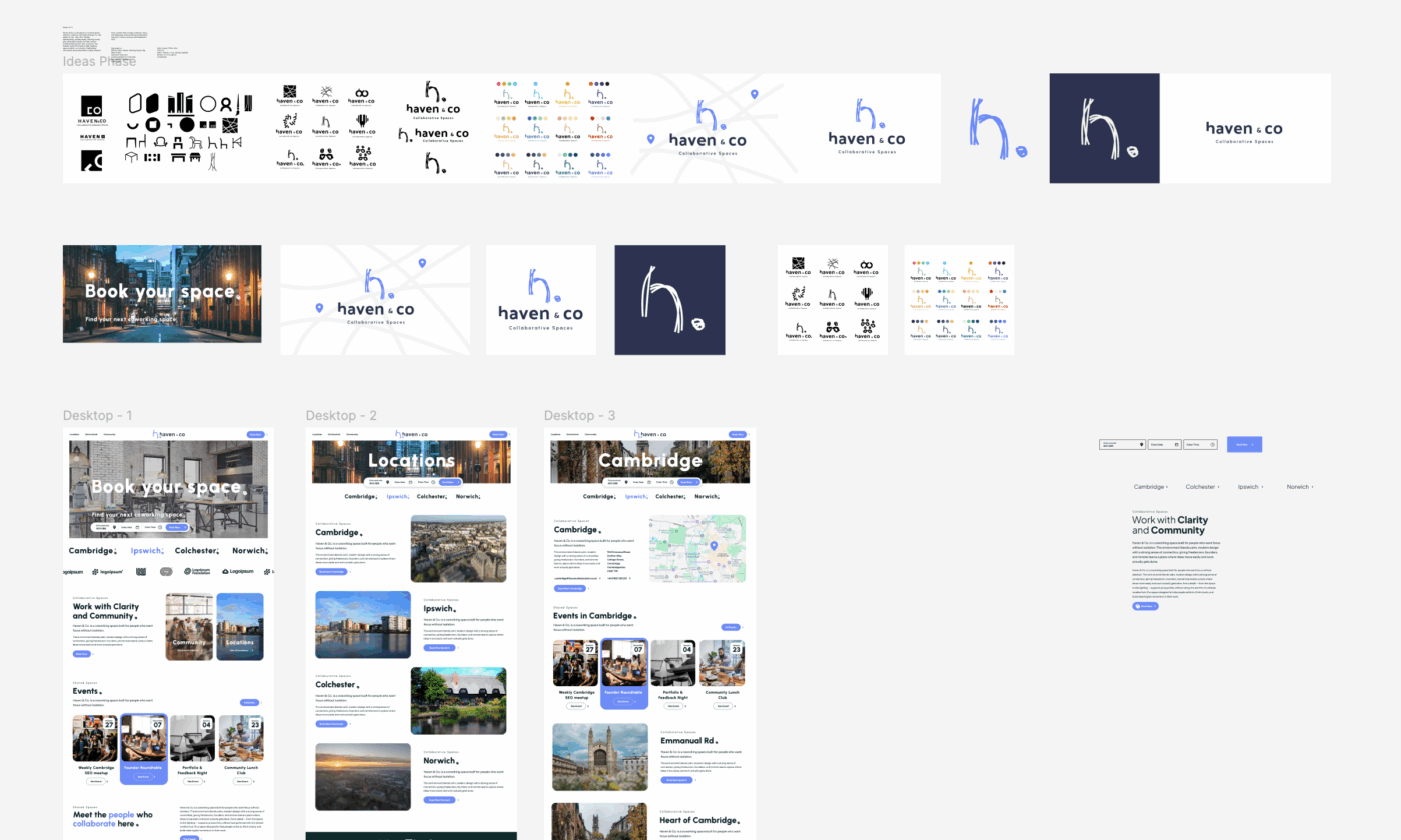
The layout keeps everything focused on clarity with simple sections, clear messaging, and seamless movement from page to page. The focus is around booking, with key call to actions clearly highlighted. We’ve used soft blurring, rounded corners and clear typography to promote the correct tones for building an exciting but factual experience.
The layout keeps everything focused on clarity with simple sections, clear messaging, and seamless movement from page to page. The focus is around booking, with key call to actions clearly highlighted. We’ve used soft blurring, rounded corners and clear typography to promote the correct tones for building an exciting but factual experience.

Branding
The colour palette and the typography and supporting visuals are designed to make the space feel calm, approachable, and thoughtfully put together.
The identity avoids loud, tech-driven aesthetics and instead leans into a quieter confidence, giving the brand a consistent look that works across digital and print.
The identity avoids loud, tech-driven aesthetics and instead leans into a quieter confidence, giving the brand a consistent look that works across digital and print.
